GDA · Gruppo VéGé
I reduced a fragmented ecosystem of seven brands and 9+ sites to three reusable information-architecture models and a 40-component library — creating a shared foundation without flattening each brand's identity.
Client
Gruppo VéGé Italian grocery group, 3,800+ stores
Role
UX designer
Timeframe
2025–26
At a glance
- Ecosystem
- 7 brands · 9+ sites
- Architecture
- 3 reusable IA models
- Delivery
- GDA live · wider rollout in development
Audit · existing sites and content operations
Fragmentation was a maintenance problem
Gruppo VéGé's seven core retail brands lived across 9+ sites on different platforms, with a different publishing workflow for each site. Maintaining current content and consistent quality was difficult. The redesign began as a technical consolidation, then became an opportunity to address weak menus, unclear hierarchies, and journeys with few useful cross-links.
I audited the existing sites, mapped their AS-IS architectures, and reviewed the maps with the group's marketing leadership. This made content priorities explicit before we proposed a new structure.


Stakeholder alignment · a consequential course correction
GDA was not another retail site
My first framing underestimated the corporate site's B2B role. Review with marketing showed that existing and prospective affiliates were a primary audience. Existing affiliates needed access to group services; prospective affiliates needed franchise options, requirements, and geographic coverage. I changed the hierarchy accordingly, adding affiliate entry points in the header and homepage and defining a dedicated journey.
Two destinations serve two affiliate needs
FIG. GDA.01
Existing affiliates


Text alternative: Two complete English interface pages from the approved Figma file provide visual evidence of the affiliate journeys. Each begins with the real GDA top bar, navigation and hero, pans through the full composition, pauses, then returns to the top. The first shows Services for affiliates for existing affiliates; the second shows Franchising for prospective affiliates, including available brands, requirements and application access.
Information architecture · service complexity over brand identity
Decision 01: three models, not one universal template
I grouped the ecosystem into three shared information-architecture models. Model A serves GDA's corporate and affiliate needs. Model B supports concise retail journeys centred on flyers and store finding. Model C adds richer editorial paths across events, products, lifestyles, and diets. The grouping follows functional complexity, not visual similarity, so each model can answer distinct needs without returning to bespoke site design.
Model A

Shared information architecture
Home
About us
- Vision · mission · values & history
Our brands
Services
News & events
Careers
Become an affiliate
Member area
Model B


Shared information architecture
Home
Flyers
- Viewer · PDF · related offers
Store finder
- Search · map · store details
Careers
Customer service
Footer
Model C


Shared information architecture
Home
About us
Store finder
Premiaty Card
Departments
Taste & territory
Promotions
Iperfutura World
Services
Contact
Footer
Text alternative: Three shared information-architecture models replace brand-by-brand negotiation. Model A is used by GDA and includes Home, About us, Our brands, Services, News and events, Careers, Become an affiliate and Member area. Model B is shared by Qui Discount and SpesaMia and includes Home, Flyers, Store finder, Careers, Customer service and Footer. Model C is shared by Iperfutura, Pickup, Conviene XXL and Talento and includes Home, About us, Store finder, Premiaty Card, Departments, Taste and territory, Promotions, Iperfutura World, Services, Contact and Footer.
System logic · stable backbone, flexible page composition
Decision 02: default architectures, composable exceptions
Brands within a model share the same architectural backbone, while content blocks can be enabled, omitted, or reordered. Qui Discount can add a page for its own product lines; SpesaMia can foreground store departments instead. Both exceptions remain assembled from the same library. I mapped a 40-component shared library before the brand skins were developed, establishing what could be reused across the ecosystem.
One page structure, one content-specific branch
FIG. GDA.03A
- Promotions
- Store locator
Content-specific module
Qui DiscountOur brandsSpesaMiaOur departments- News
Text alternative: One ordered Model B homepage structure begins with Promotions and Store locator. It then branches at one content-specific position: Qui Discount uses Our brands while SpesaMia uses Our departments. Both paths rejoin at News.
The same structure supports two retail expressions
FIG. GDA.03B
Qui Discount


Text alternative: Two English homepages use the same Model B foundation. Each begins at its navigation and hero, then pans through promotions and store finding to the content-specific position. Qui Discount ends on its Our brands catalogue; SpesaMia ends on Our departments. Each screen pauses there, then returns to the top.
Design system · Figma as an implementation reference
Decision 03: document behaviour, not just appearance
I structured the component library with the UI designer and development team. Each Figma page combined desktop and mobile variants, usage guidance and, where needed, an example in context. Instead of a gallery of finished UI, the file became a shared implementation reference for reusable WordPress blocks.
The working file made the system explicit
FIG. GDA.04
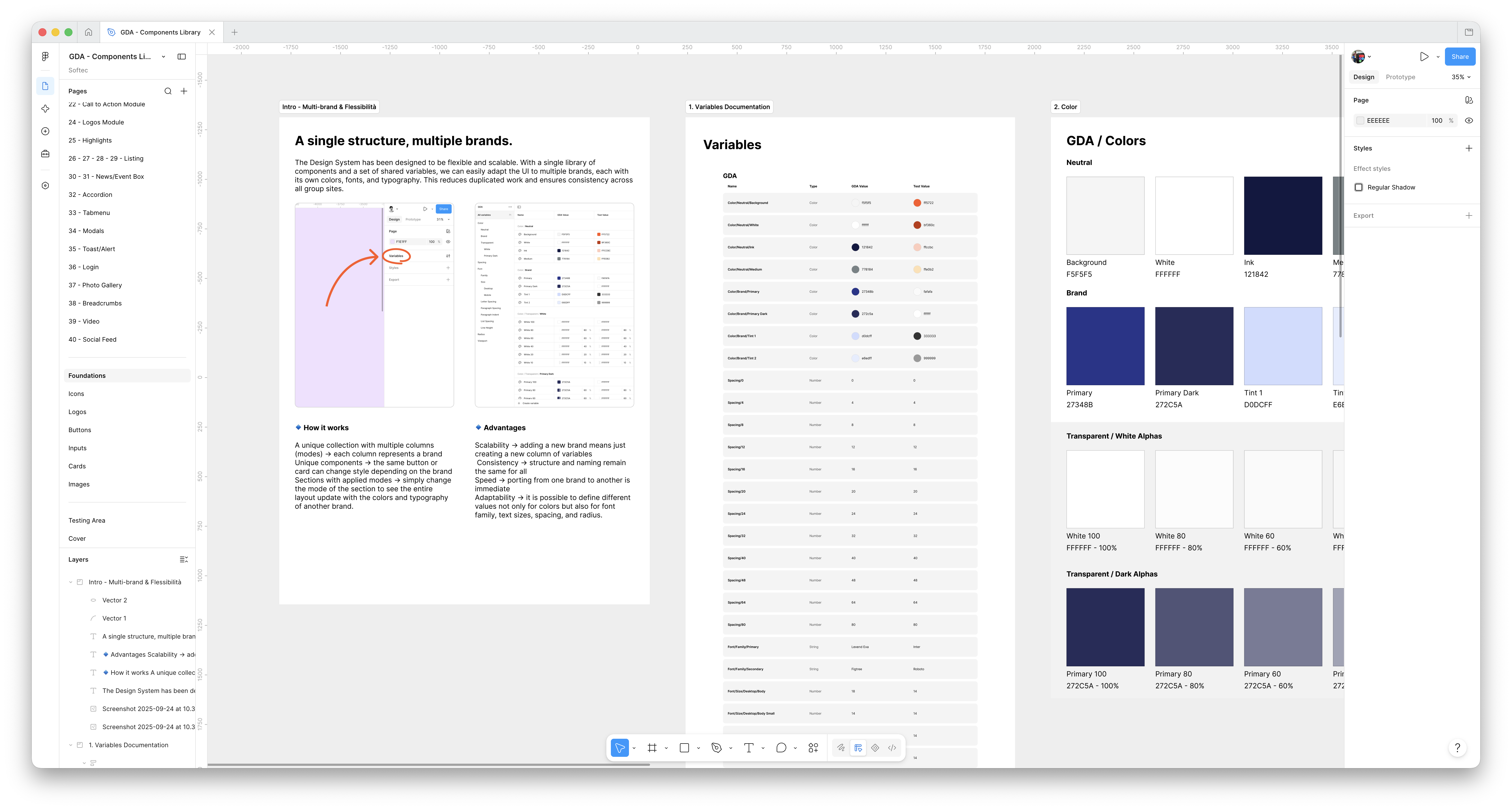
Text alternative: A screenshot of the real GDA Components Library open in Figma. The Foundations page is selected in the file navigation. Its canvas shows an English introduction titled A single structure, multiple brands, the shared variables documentation and the GDA colour foundations, with the Figma interface and layer panels visible around the work.
Store locator · design and development in parallel
A delivery constraint became a reusable variant
The store locator used one Map & Location Cards component across customer stores, corporate offices and affiliate coverage. While Google Maps approval was pending, I worked with development on a list-only version so implementation could continue. The temporary constraint became a reusable alternative wherever a map was unnecessary or unavailable.
One locator, two delivery-ready views
FIG. GDA.05
Map view


Text alternative: Two desktop states of the same locator component. Map combines direct search and location cards with spatial pins and a selected location. List exposes the same locations through filters and cards without depending on a map.
Delivery · shared system, distinct brand expressions
A live foundation for the wider rollout
GDA is live, while the wider ecosystem remains in development. Qui Discount and SpesaMia were developed in parallel from the same model, demonstrating that the shared architecture could support distinct brand priorities. The team reported faster reuse after the initial alignment, and client feedback on GDA and its fit with business needs was positive.
Roughly 90% component reuse remains a working estimate discussed with the development team, not an instrumented product metric. There was no formal timing study, so I do not attach a speed percentage to the improvement.
Ownership · governance lesson
Scope, and what I'd change
As UX designer, I led the audit, IA mapping and three-model definition, then shaped the wireframes and design-system structure. I shared UI work with the UI designer and collaborated closely with development.
Next time, I would align the component grammar with engineering earlier. Figma's atom-and-molecule taxonomy did not map cleanly to reusable WordPress blocks, so we corrected it midstream around editorial modules. I would make that agreement a starting condition for the system.


