FLEXA
My UX/UI work helped turn a fragmented AI-learning platform into one coherent product — for four different relationships with the same platform.
Client
POLIMI Graduate School of Management
Role
UX/UI design
Agency · timeframe
ux.boutique · Early 2021–mid 2022
Status
Shipped
Product film paused
At a glance
- Scope
- Five redesigned product areas: onboarding, assessment, homepage, dashboard, and companies/jobs
- System
- A shared design system with reusable components and light and dark themes
- Validation
- Testing with active users informed dashboard priorities and clearer skill assessment
Product challenge · four audiences, one hub
The challenge: turn fragmented features into one journey
FLEXA already combined learning content, assessment, networking, and job search, but those capabilities did not yet read as one product. The redesign also had to translate Interbrand's print-led identity to screen, raise engagement, and serve four audiences without splitting the platform into four separate experiences.


Homepage · before / after
The redesigned homepage replaces the fragmented activity feed with a clear hierarchy of goals, progress, current learning, and recommended next actions.
The homepage had to bring four product areas into one coherent experience.
Personalised learningGoals and interests shape what appears next.
Assessment and progressSkill gaps become visible actions.
Community and networkLearning remains connected to people.
Companies and opportunitiesDevelopment leads beyond content.
Research synthesis · five product areas
The approach: define what had to change
I supported card-sorting and brainstorming workshops with students and stakeholders, benchmarked comparable products, and mapped the existing information architecture. The synthesis focused the redesign on onboarding, assessment, homepage, dashboard, and companies/jobs.
Weekly working sessions and wireflows helped us resolve where shared patterns could hold and where an audience needed a different continuation. The product architecture was agreed before its visual layer.
Different needs. One coherent platform.
Research surfaced different motivations and access patterns. The redesign resolved them within one shared product system.
Audience → priority need → design decision
Audience
Students
What the research surfaced
- Understand skill gaps
- Stay motivated over time
- Find relevant learning
How the product responds
Make progress actionable
Use staged assessment, visible progress, badges, and a daily workout.
Audience
Alumni
What the research surfaced
- Continue learning
- Stay connected
- Access opportunities
How the product responds
Design for return
Use light re-onboarding, community modules, and job discovery.
Audience
Prospective students
What the research surfaced
- Understand the offer
- See future value
- Explore without commitment
How the product responds
Guide without locking in
Provide a clear entry point, visible pathways, and selective access.
Audience
Companies
What the research surfaced
- Find talent
- Publish opportunities
- Navigate roles
How the product responds
Connect learning to opportunity
Use company profiles, a dedicated jobs area, and role-based paths.
Four audience-specific need sets led to different product decisions within one coherent FLEXA platform.
Dashboard · prototype-led alignment
Decision 01: make progress tangible
Users found the dashboard overwhelming and flat. I reorganised it around weekly goals, visible progress, badges, and the relationship between activity and skill development.
When gamification met resistance, I built an interactive prototype backed by heuristics and competitor references. Showing the proposal in context aligned stakeholders more effectively than another presentation of the idea.
Progress becomes something users can act on
FIG. FLEXA.04
Goals, badges, skills, and time are composed as one readable model. The dashboard shows both the commitment and the work behind it.
Assessment · Before
Percentages without clear next actions
Users struggled to understand how the skill percentages related across hard, soft, and digital skills.
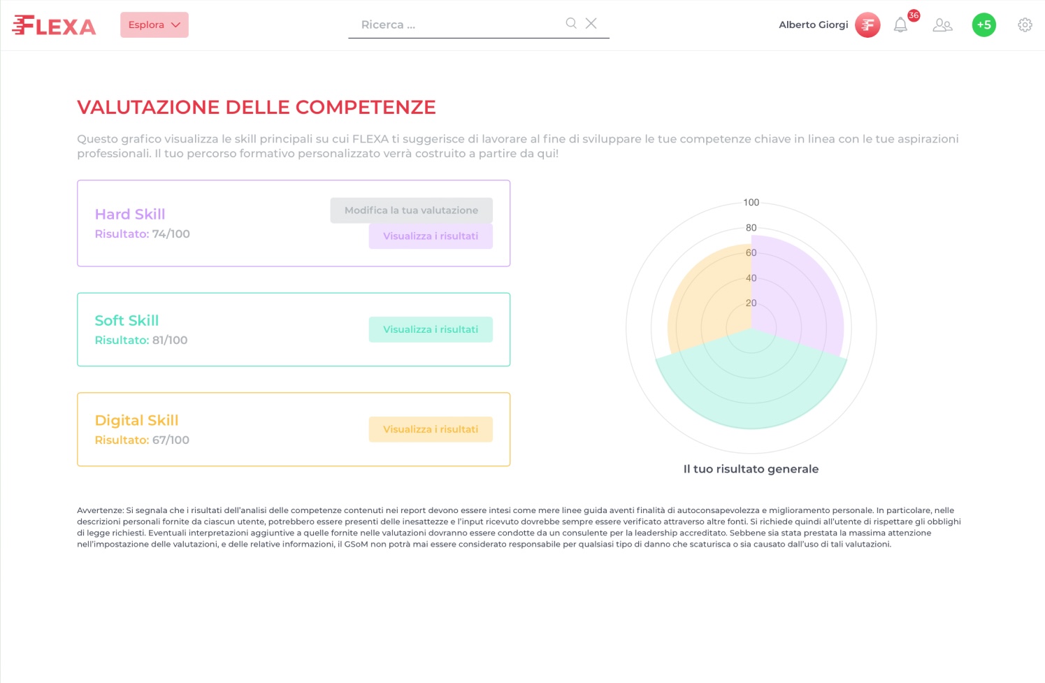
Assessment · After
Skill areas with distinct states and actions
Reworked labels and explanatory copy with the UX writer, then separated the skill areas into clearer states and next actions.
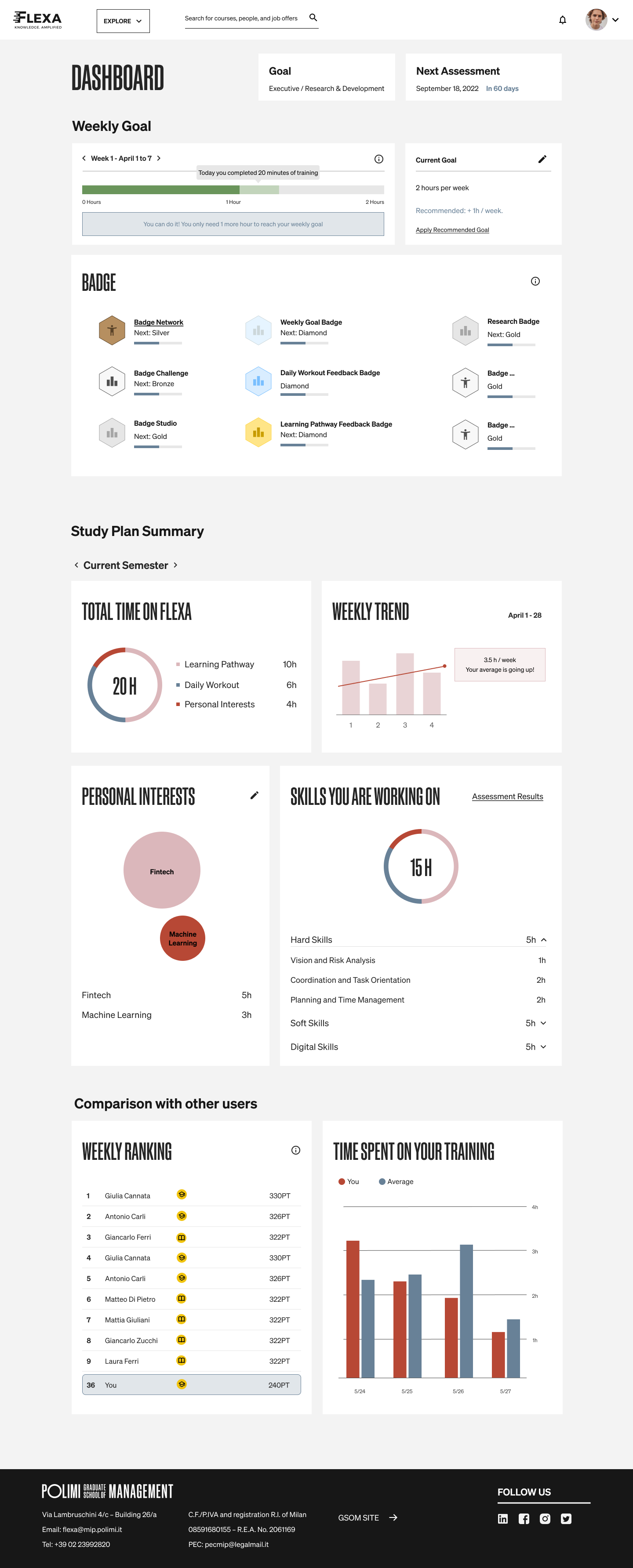
Dashboard
Commit to a weekly goal
A weekly goal turns activity into a commitment.
Dashboard
Review the study plan
The study plan summary shows where learning time is being spent.
Dashboard
Compare progress with peers
Weekly ranking and time spent connect individual progress to the wider learning community.
Goals → assessment → learning path
Decision 02: turn personalisation into a journey
Personalisation could not stop at a tailored landing page. The journey begins with a professional goal, makes the related skill gaps visible through assessment, and turns those gaps into a learning path with a clear next action.
Personalisation is a sequence, not a setting
FIG. FLEXA.05


Text alternative: Each step gives the next one useful information: aspiration defines direction, assessment locates the gap, and the platform turns that gap into action. The sequence shows professional goal selection, a skill self-assessment, and the initial homepage view with progress and Daily Workout recommendations.
Digital language · reusable product system
Decision 03: build one system across many touchpoints
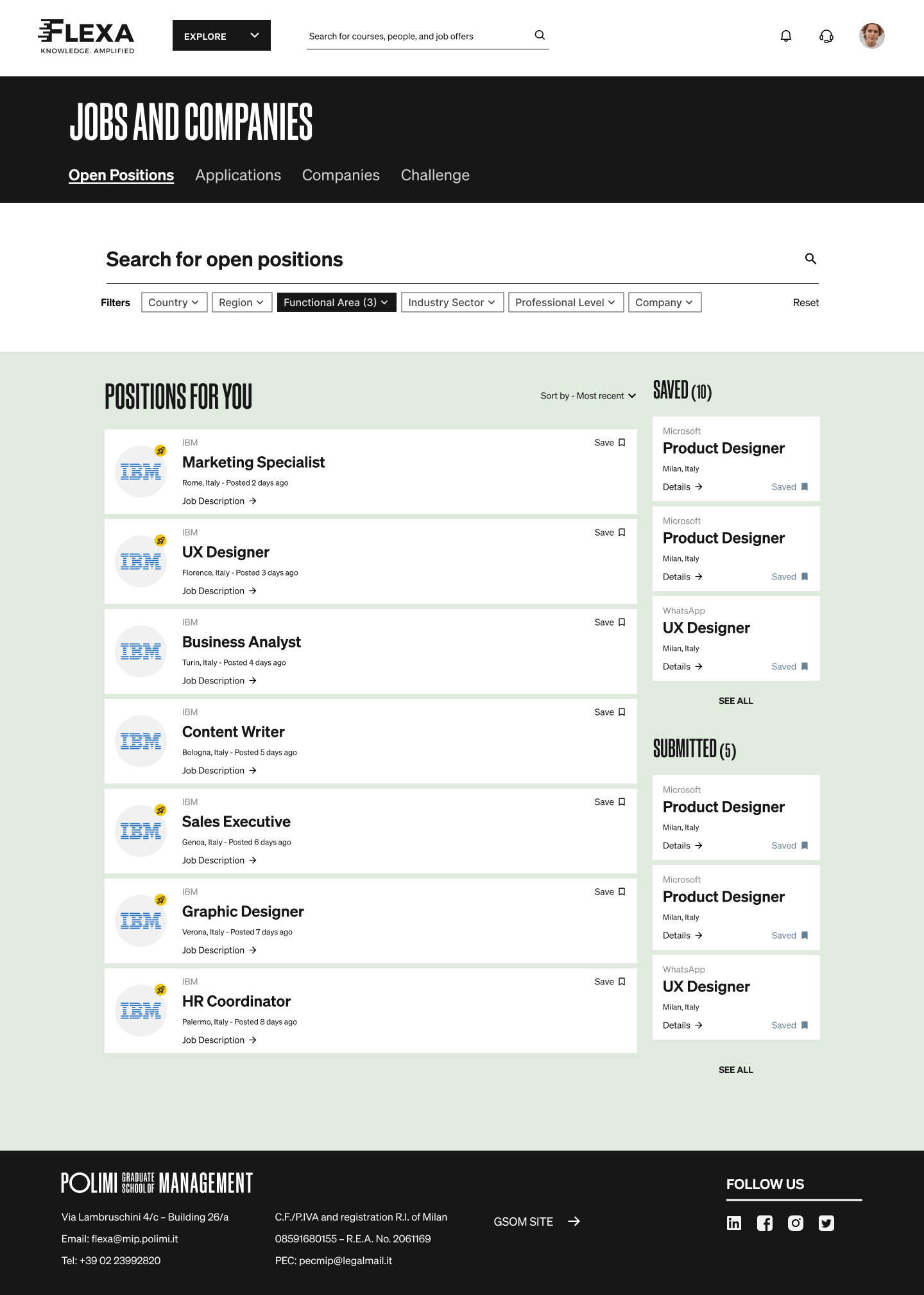
With the UI director, I translated Interbrand's typography, layout, and colour into digital wayfinding: pink for learning, green for opportunities, and blue for networking. The shared shell stayed recognisable as the product changed room.
I led the setup and continuous refinement of an atomic design system covering components, states, section logic, and light and dark themes, so multiple journeys and vendors could work from one source of truth.
One product shell, many connected rooms
FIG. FLEXA.06
Opportunity extends the learning journey, while section colour and shared components let each area change character without becoming a separate product.
Ecosystem
Section colour as wayfinding
Green identifies Companies & Jobs, using the brand palette to orient people as they move through the product.
Ecosystem
Profile colour personalisation
Each person can choose from the POLIMI SOM palette, using colour for personal expression inside the shared profile.
Ecosystem
Shared component system
Reusable patterns let each area change character without changing product.
Active users · high-fidelity prototype · Unguess
Validation: what testing changed
With the UX researcher, I tested four core journeys with active users. The sessions changed dashboard priority and assessment clarity before handoff; findings remain qualitative.
Testing changed what reached handoff
FIG. FLEXA.07
A high-fidelity prototype tested with active users exposed two issues before handoff: dashboard priority and assessment clarity.
Tested journeys
- Registration
- Skill assessment
- Content discovery
- Dashboard review
Light ↔ dark mode check
Light and dark modes were compared qualitatively.
Observed issue
Badges appeared before the Study Plan Summary, despite users valuing the plan more.
Adjustment
Moved the Study Plan Summary directly below the weekly goal; badges moved further down.
Text alternative: four journeys were tested with active users. Light and dark modes were compared qualitatively. Dashboard feedback set the final order as weekly goal, Study Plan Summary, then badges; assessment labels were also clarified.
Shipped outcome · honest reflection
Outcome and reflection: what shipped, what testing exposed
I worked as UX/UI designer alongside a UX researcher, UX director, and UI director for POLIMI's Learning Experience and Marketing team, with Interbrand on branding, Unguess on testing, and BlueIt on development. The redesign shipped onboarding, assessment, homepage, dashboard, and companies/jobs as one extensible system; feedback on layout and content organisation was positive, and the client said it exceeded expectations.
One limitation is visible in the work: the first high-fidelity dashboard still put our content hierarchy ahead of users' perceived priorities. Unguess sessions exposed it before handoff, and we reordered the final design. That correction made FLEXA an early lesson in using evidence to challenge the design, not only to validate it.


