Electrolux Professional
I led the mapping that turned a fragmented global corporate site into 10 reusable page templates, then carried the system through responsive UI, visual-attention validation, and developer handoff.
Client
Electrolux Professional Group
Role
UX/UI designer
Team
ux.boutique / inTarget
Timeframe
Mid–late 2023
Status
Delivered

At a glance
- Problem
- A corporate site fragmented across hundreds of pages
- System
- 10 reusable master templates
- Delivery
- Responsive UI kit, attention check and developer handoff
Challenge · information architecture
A global site fragmented across hundreds of pages
Electrolux Professional's corporate site serves business clients and partners across hospitality, foodservice, and healthcare. Its content had accumulated across scattered micro-pages, a crowded navigation, and page structures that struggled with denser information.
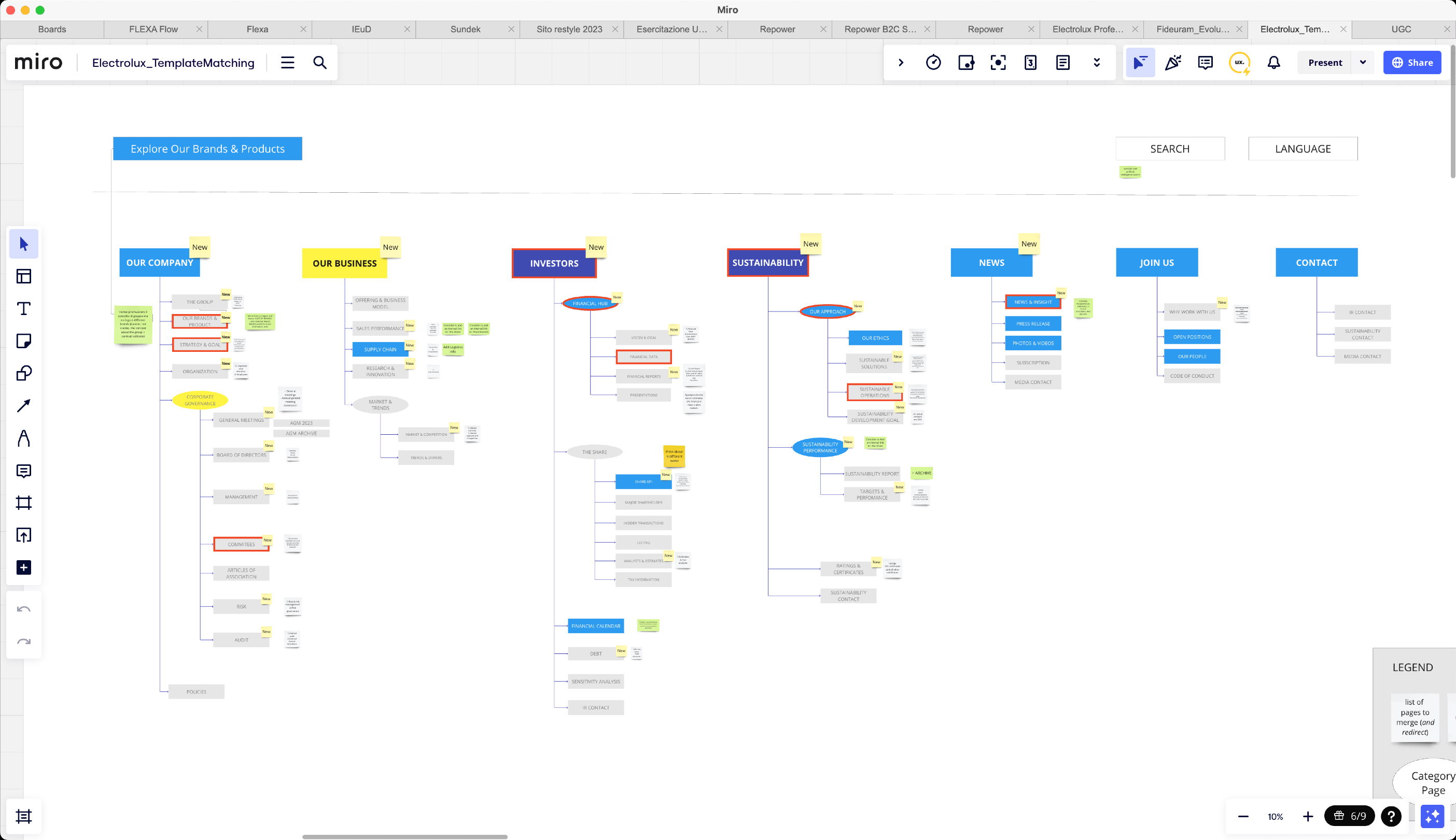
We began with a remote stakeholder workshop and a benchmark of B2B corporate sites. Working alongside the UX architect, I audited the proposed structure against the existing site to expose recurring content patterns before we drew screens.
Core decision · master-template strategy
Ten templates, not hundreds of exceptions
The project scope allowed just 10 master templates. I led the mapping between those templates and the site's real content, documenting the relationship in a Miro table so every section had a deliberate home.
The constraint became the system: a small, maintainable set of page types flexible enough to cover the content estate without recreating the fragmentation inside the new design.
Starting pages
Primary entry points for section-level journeys.
01
Investors
Our Company · Our Business
Reference for almost every starting page; News, Contacts and Join Us remained to evaluate.
02
Sustainability
Sustainability landing
A second starting-page structure selected for validation.
Category pages
Reusable hubs for grouped corporate and investor content.
03
Our Approach
Share KPI · Markets & Trends · Sustainability Performance · more
The reusable base for almost every category page.
04
Financial Hub
Investor category content
A second category structure selected for validation.
Content pages
Flexible structures whose components adapt to the material.
05
Strategy & Goal
The Group · Organization · General Meetings · Management · Risk · Audit · more
One structure whose internal components change with the content needed.
06
Committees
Committee content
A second content-page structure selected for validation.
Dedicated & detail
Purpose-built structures for needs the shared families could not absorb.
07
Homepage
Corporate homepage
A dedicated entry point rather than a category-page adaptation.
08
Financial Data / Sustainable Operations*
Share Price · Share Capital · Our Ethics
Handles detailed tab content: tables, graphs, data, text and lists.
09
Our Brands & Products
Brand and product content
A new structure to define with content supplied by the Electrolux Professional team.
10
News & Insight
News · Why work with us
A partially new structure combining new material with the current content estate.
From wireframes to UI
Three UI directions, one responsive system
Using the same sustainability page made the trade-offs visible: Conservative prioritised familiar corporate patterns and photography; Modern Rounded introduced softer containers and an editorial rhythm; Minimal Icon Based used large type and modular icons to reduce reliance on imagery.
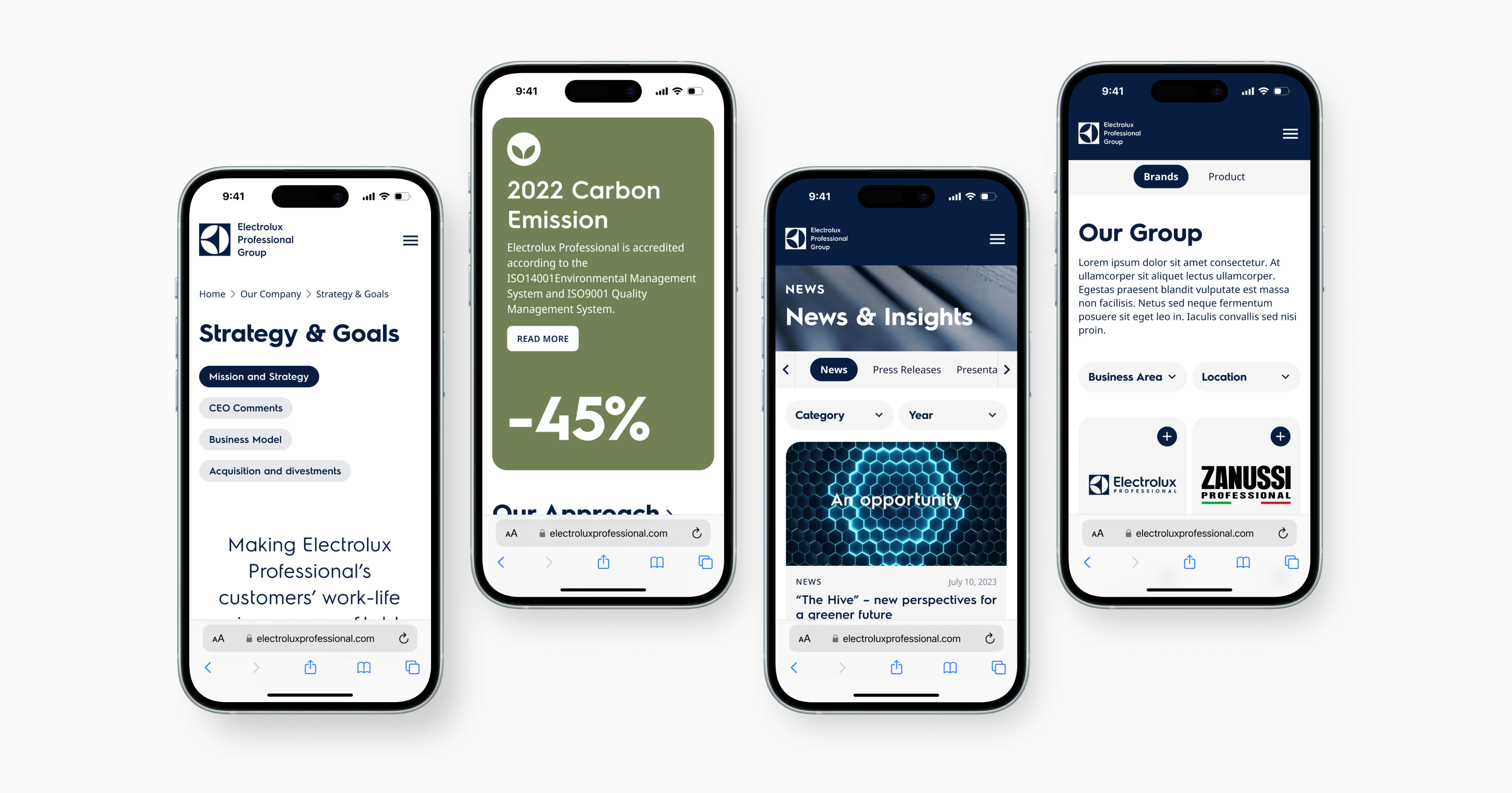
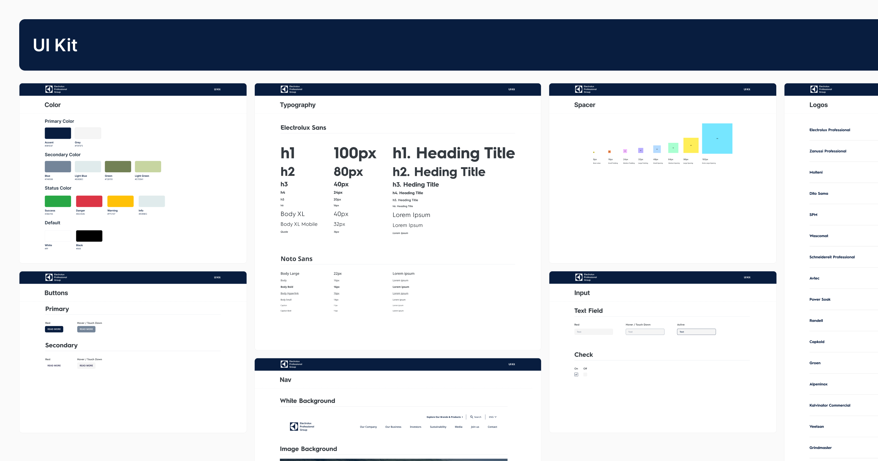
The final responsive system combined Modern Rounded with the image-light modularity of Minimal Icon Based, then carried it across desktop, tablet, and mobile in a Figma UI kit.
Visual direction


Text alternative: Three alternative desktop treatments of the same sustainability page: a conservative photographic route, a rounded editorial route and a modular icon-led route.
Direction carried forward
The final system combined the rounded structure of the second route with the modular, image-light logic of the third.

Attention prediction
Validation before handoff
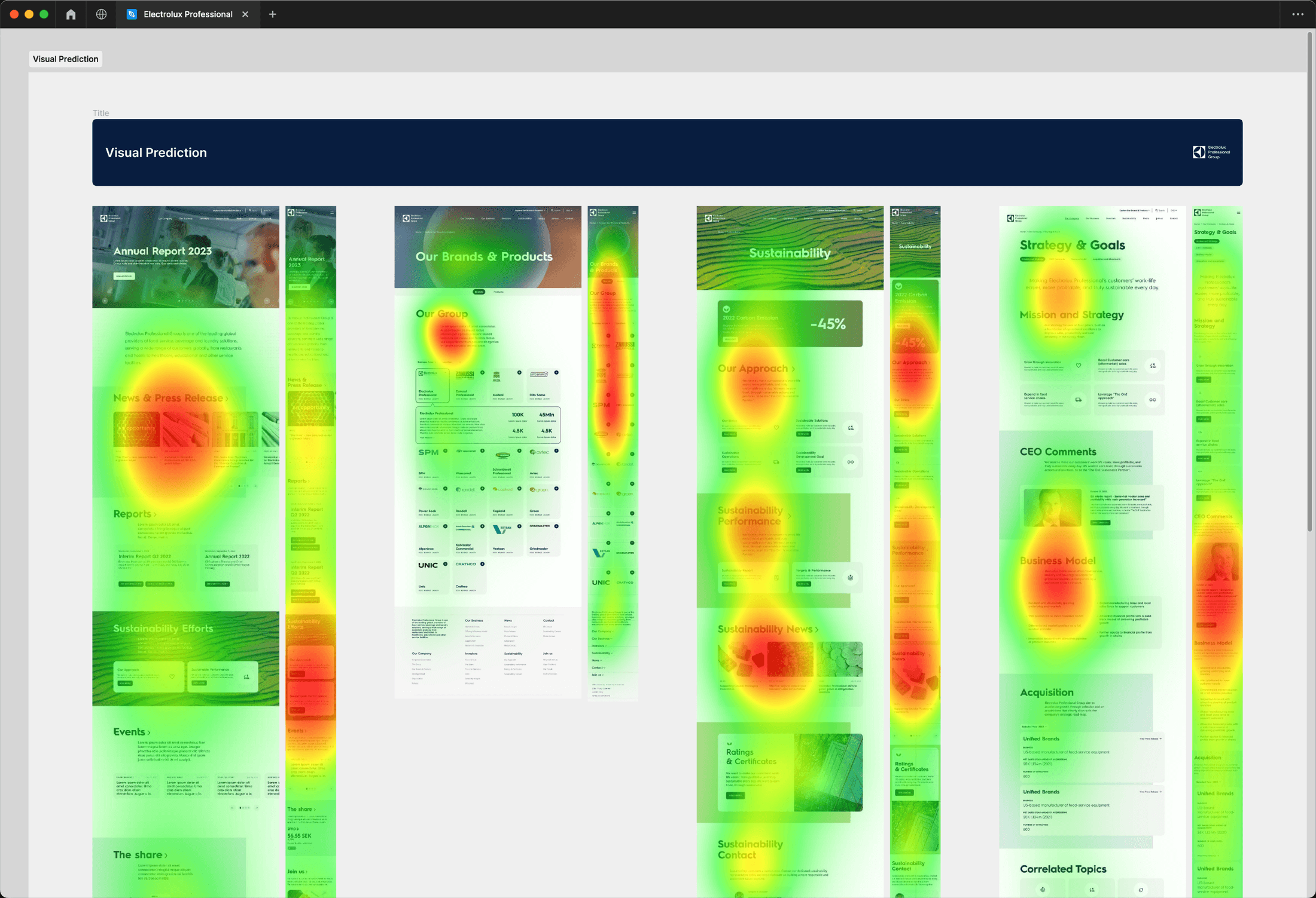
We used Neurons Predict to check whether predicted visual attention reached the intended calls to action on the news and sustainability layouts. This was an attention-model check, not a usability test or evidence of post-launch impact.
Reflection
What the constraint taught me
The final interface worked because the discipline underneath it made the system reusable. A hard template limit forced clearer decisions about hierarchy, reuse, and ownership across several stakeholder groups.
It also reinforced a practical lesson: involve developers early enough for implementation constraints to shape the system, not arrive as exceptions during handoff. No post-launch analytics were available in the source material, so the outcome here is the delivered template and UI system rather than a claimed performance uplift.


