Amplifon NEXT
A shared hearing-aid consultation for 26 countries: one clinical core, controlled local selling rules.
Context
In-store software · ~9,700 stores
Role
UX/UI design
Year
2024–2025
Status
9 markets shipped
At a glance
- Problem
- One shared consultation, different local selling models
- System
- A common clinical core with configurable market-specific regions
- Delivery
- Localised comparison and quoting shipped in nine markets
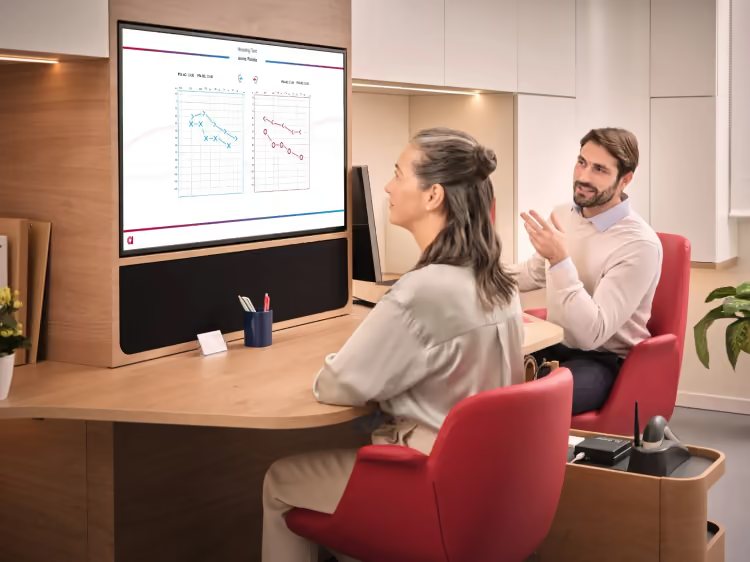
The product · shared consultation
One screen, one consultation
From the first questions to the offer, the hearing specialist and customer follow the same flow.
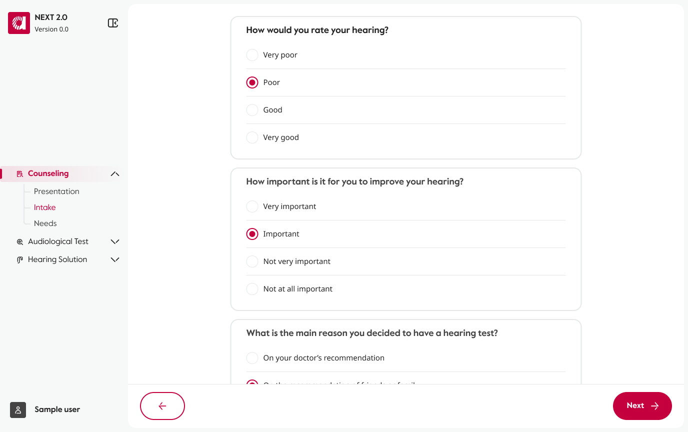
Before · inherited template
The template I inherited, and the ground moving under it
I inherited a global template begun by another consultancy. Inconsistent UI, unpredictable toggles and overlays disrupted the consultation; its visuals were out of step with Amplifon's digital products. Polishing individual screens would not fix the structure.
The consultation also had to fit a Salesforce migration as Amplifon aligned its digital products around ARIA, its design system. The template needed to serve regional needs across marketing, offering and development. How could one consultation stay coherent while each market sold differently?

One template, five constituencies
Design connects offering, marketing and development — the position from which one template could be argued across them.
FIG. AMP.01
- Regional representativesReaches the product through marketing
- MarketingShares ground with regions, offering, design and development
- OfferingShares ground with marketing and design
- DevelopmentShares ground with marketing and design
- DesignOverlaps offering, marketing and development
Countries in the ecosystem
- Countries
- 26
- Stores
- ~9,700
- Markets delivered
- 9
Text alternative: A pixel map of the world, redrawn from the project's own footprint map. The lit cells span North America, parts of South America, western and central Europe, Egypt, India, China, Australia and New Zealand — the roughly 26 countries where the ecosystem runs, in around 9,700 stores. Nine of those markets received the localised comparison and quoting designs described in this case; which nine is not shown, because the case names only five of them.
Design model · the invariant clinical core
What can change, and what cannot
A consultation has three parts: local intake, a clinical core, and the offer. Intake can differ by market; the offer has to reflect its commercial model. The clinical core stays the same — needs, test, results, perception, fitting and demo — because it follows one medical sequence.
That distinction made one build instead of nine possible. I defined local regions: explicit areas of the interface where a market could add its own content or control. A market changed a value in a reserved region, not the product around it.
Intake
Varies by market
- Hearing & health history
- Listening challenges
- Attitudes toward hearing aids
Clinical core
Shared across markets
- Needs
- Otoscopy
- Test
- Results
- Perception
- Fitting
- Demo
Offer
Varies by market
- Compare
- Quote
- Order
- Report
Text alternative: The consultation flow runs embedded in Salesforce and is localised into the language of each market. It has three blocks. Intake varies by market and includes hearing and health history, listening challenges, and attitudes toward hearing aids. The clinical core — needs, otoscopy, test, results, perception, fitting, demo — is identical in every market because it is medical. The offer block varies by market again, and holds its own steps: compare, quote, order and report. The first and last blocks are marked Varies by market; the clinical core is marked Shared across markets.
- Assemble one global template layer
- Product catalog
- ARIA design system
- Modular components — the design choice
- Adapt it in the local layer
- Legal and medical rules per market
- Commercial and pricing rules per market
- Is local content defined for this market?
- No → the global default renders
- Yes → the designated per-country region renders
- No fork per market
Research · replica store, continuous
The room it's used in
Amplifon keeps full-scale replica stores at HQ. There we ran working sessions with former hearing specialists who now worked at headquarters and knew the sales dynamics firsthand.
This was continuous design input, not formal user research. It changed two decisions: how prices are exposed, and how customers compare products. Both appear in the next two flows.
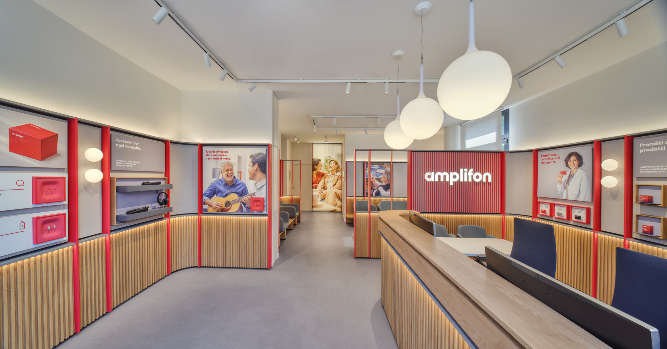
Text alternative: Interior of a full-scale replica of an Amplifon store inside the company's headquarters: a wooden slat counter in the foreground, product display walls on either side framed in red, a backlit amplifon wordmark on the centre wall, and a waiting area with seating beyond it.
Decision · comparison and quoting
The two moments that carry the sale
I focused on the two moments where markets diverged most: product comparison and the quote, where a recommendation becomes an offer. I designed both under the lead designer.
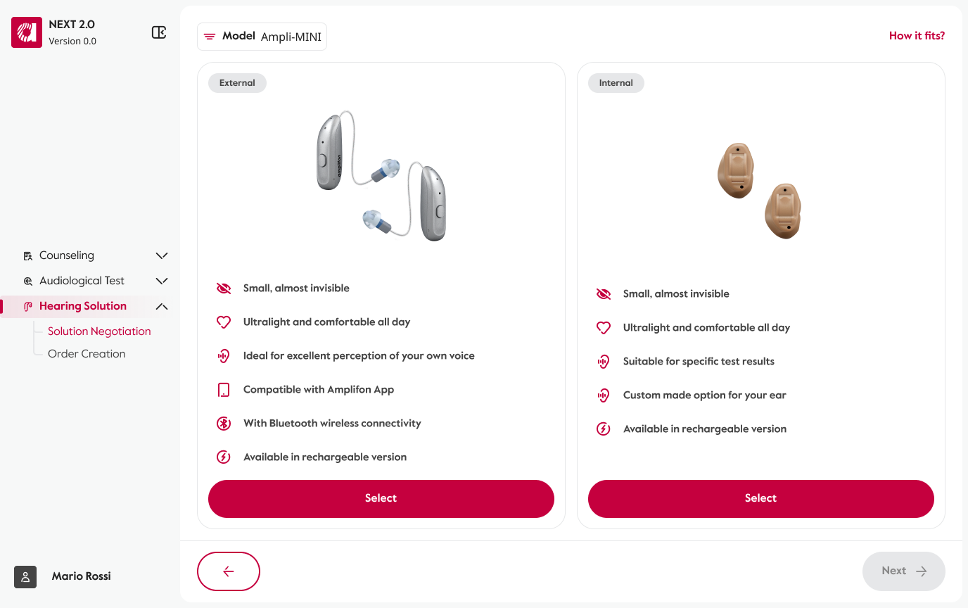
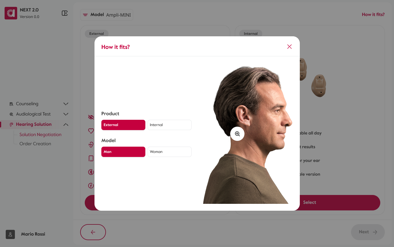
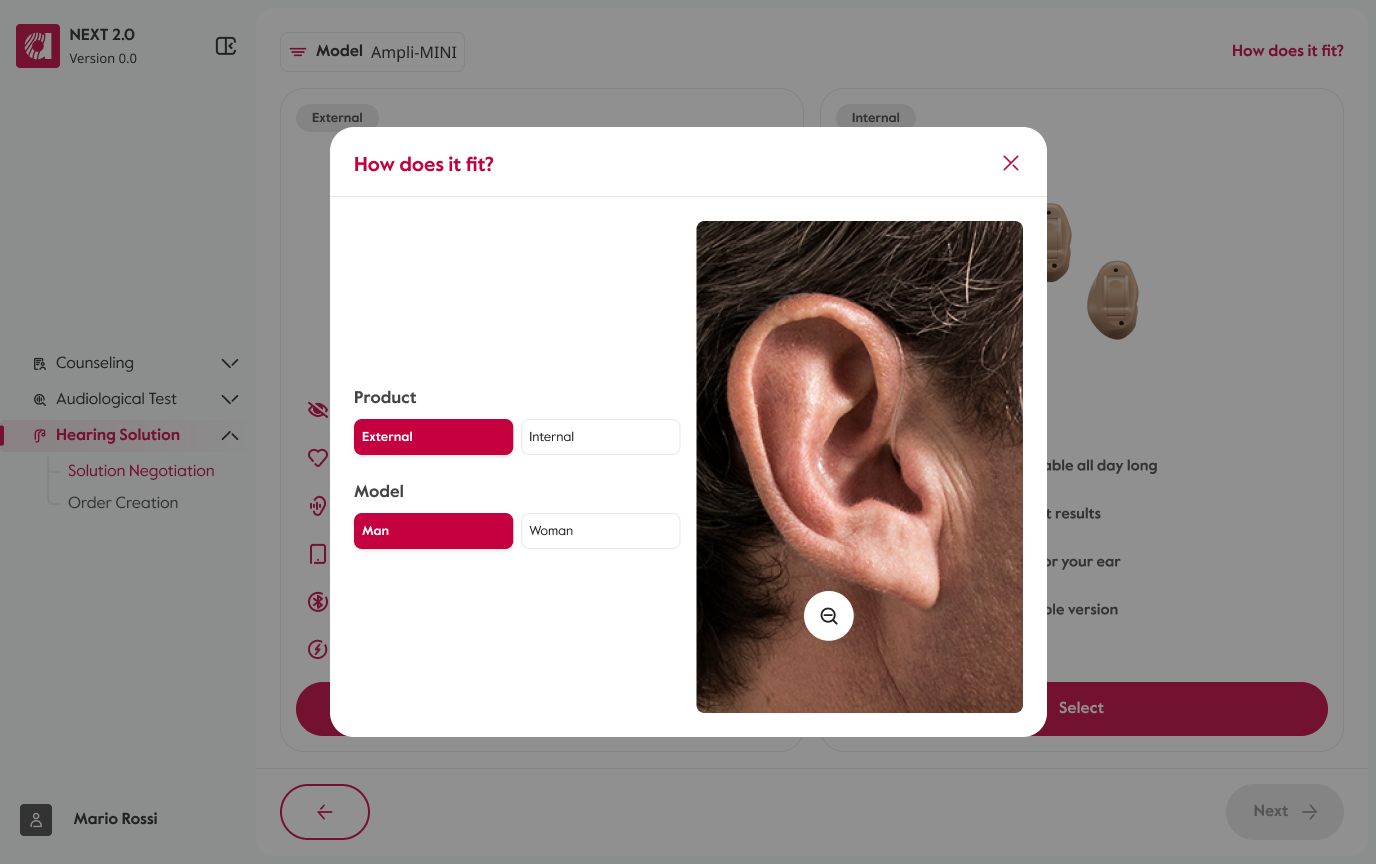
Comparison: I put options side by side with a clear selected state. A separate overlay answers fit — how an external aid sits behind the ear — without interrupting the comparison.
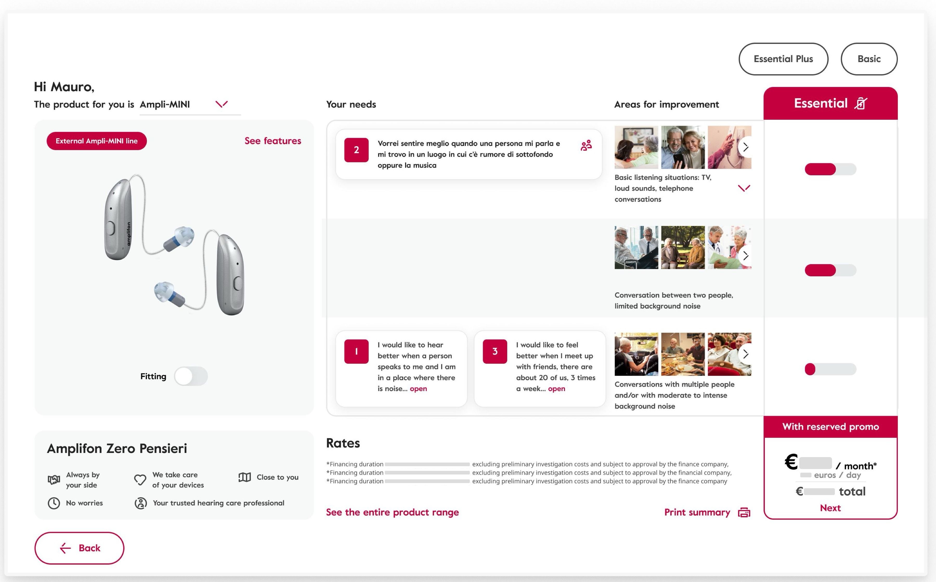
Quoting: I made offers comparable row by row, moved secondary detail into overlays, and placed the next action beside the selected offer.
Modularity: I replaced a stack of “+” buttons with a split dropdown and a defined region for each market block.
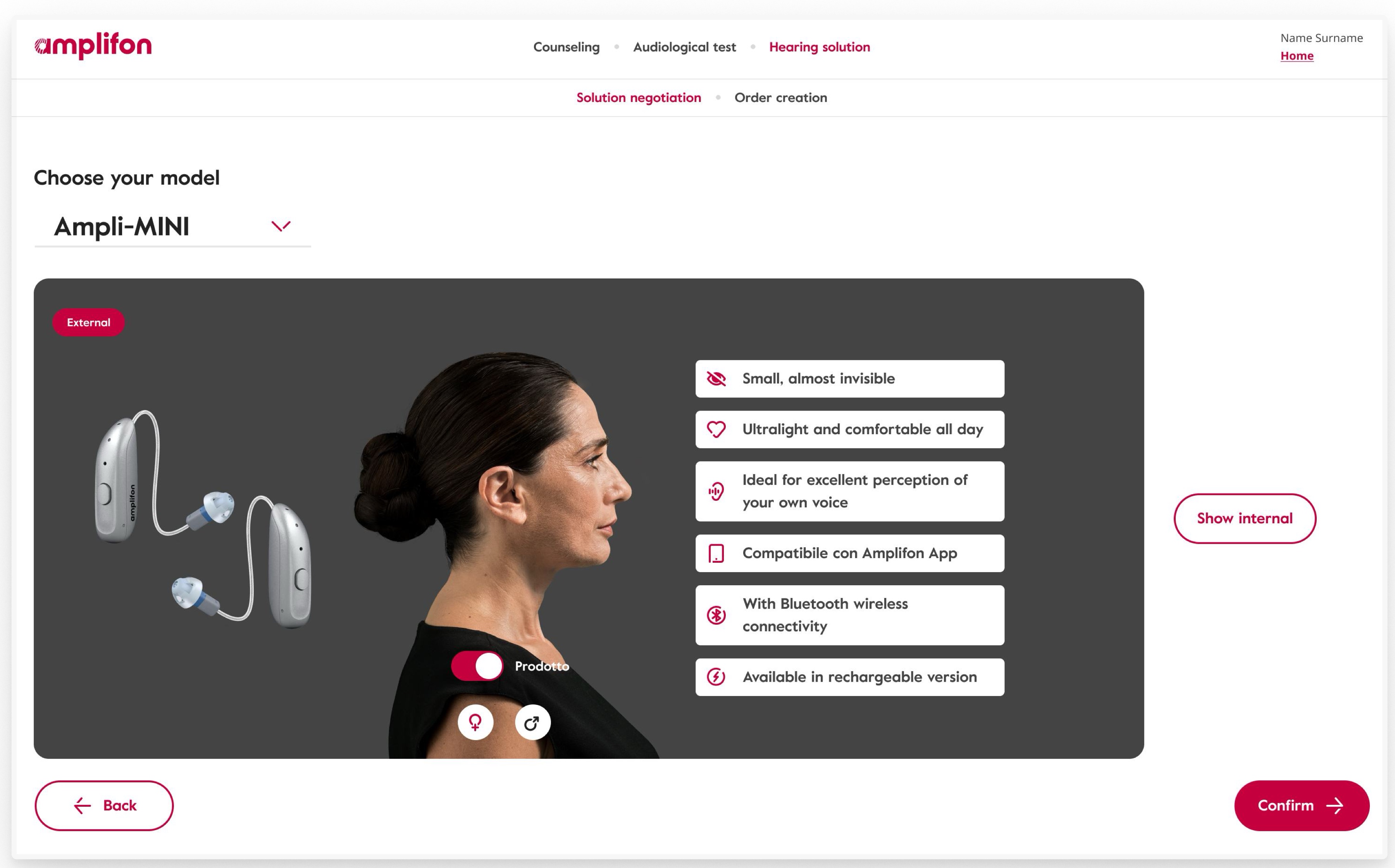
Product comparison · Inherited
One model at a time
One hidden alternative forces comparison from memory.
Product comparison · Redesigned
Two options, one structure
Matching cards compare both options side by side.
Product comparison · Redesigned
Fit, without leaving the comparison
An overlay answers fit without leaving the comparison.
Product comparison · Redesigned
Close enough to decide
Ear-level zoom reveals how discreetly the aid fits.
Quoting · Inherited
One tier priced at a time
One priced tier hides alternatives and the next action.
Quoting · Redesigned
Offers that compare row by row
Aligned rows clarify offers and surface the next action.
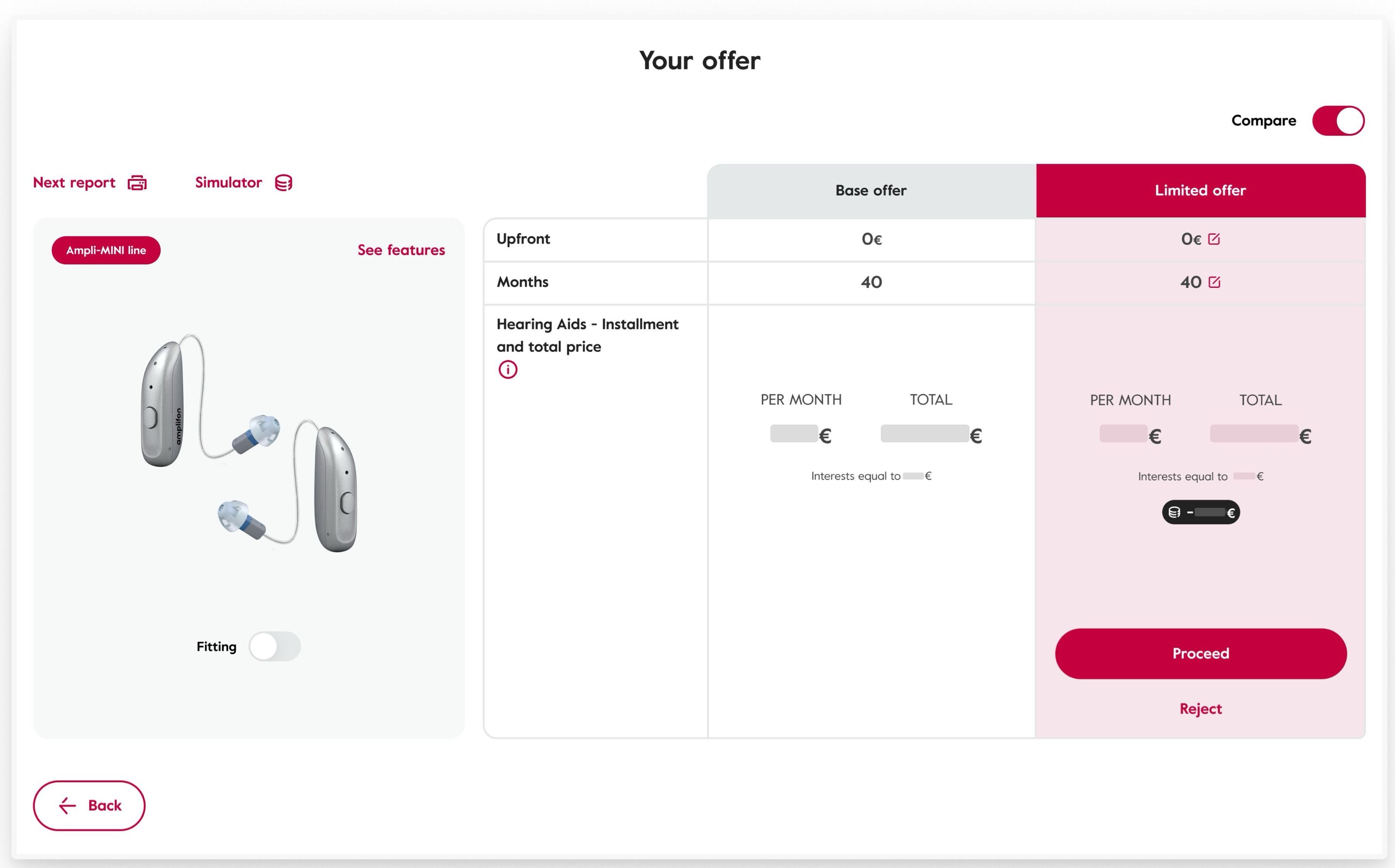
Text alternative: Two step sequences, each opening on the inherited screen. Product comparison, inherited: a “Choose your model” dropdown above one dark panel holding a single product, its characteristics listed beside a photo of a person wearing it, with a separate “Show internal” button outside the panel. Rebuilt: two option cards side by side with identical structure, each with its own select action, and a link in the top right that opens a fit overlay carrying product and model selectors, the aid shown worn on a model, and a zoom that goes to the ear — where an external aid, sitting behind it, is barely visible. Quoting, inherited: the product in a left column, the customer's needs and areas for improvement in a table in the middle, and one priced tier on the right, with the other tiers as pills parked above it and the continue action inside the price block. Rebuilt: one offer table where two offers compare row by row on the same attributes, with secondary detail moved into linked overlays and the primary action inside the selected offer. On both quoting screens the monetary values are masked; neutral bars occupy the space the figures held.
Delivery · nine markets
Four ways of selling the same product
Localised comparison and quoting shipped in nine markets. Markets differ in how hearing aids are sold; the offering team, the central group for sales strategy by country, set each commercial model.
One structure held across all of them: the top band could host market-specific controls, an optional fourth column could hold local services or warranty extensions, and pricing controls appeared only where needed. Brand differences were mainly accent colour.




Text alternative: The top band of the same product-comparison table, shown in four markets. The United Kingdom is the simplest: three tiers — Excellence, Advanced Plus, Advanced — and a header holding only the current selection. Germany sells through insurance: the tier labels differ and the header carries the market's own zero-tariff and report links. Spain adds an all-inclusive package as a fourth column and a market-specific card toggle. Switzerland combines insurance with loyalty-scheme discounts: an insurance selector and a price-management control in the header, and a fourth column of local services. In every case the layout, the row structure and the tier band are the same build; the variation is confined to the header and the extra column.
Decision · explaining the loss
Making a loss you cannot see
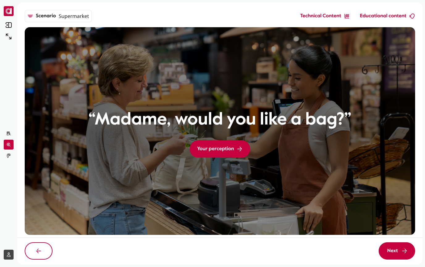
An audiogram is not self-explanatory. I designed the shipped perception simulation so the specialist could explain the result in the shared view.
Instead of asking the specialist to describe a chart, it demonstrates the loss in an everyday scene the customer can recognise. Both can then discuss the same evidence on the same screen.
Reflection · mediated access
Scope, and what I'd change
I worked under a lead designer, in daily contact with stakeholders and development. When marketing and offering pulled in different directions, I used interactive prototypes to make the trade-offs concrete.
I would still push for direct in-store observation before finalising: watching the shared consultation with a real customer, rather than relying mainly on mediated access to specialists.


